
US pollen levels across the year

When I plan travel, one of the things I consider is the pollen levels that will be present at my destination while I’m there. I haven't been able to find a satisfactory source for this information, so I've been recording daily pollen readings from around the US for the past 8 months. Here are four things I've made to help myself explore the data.
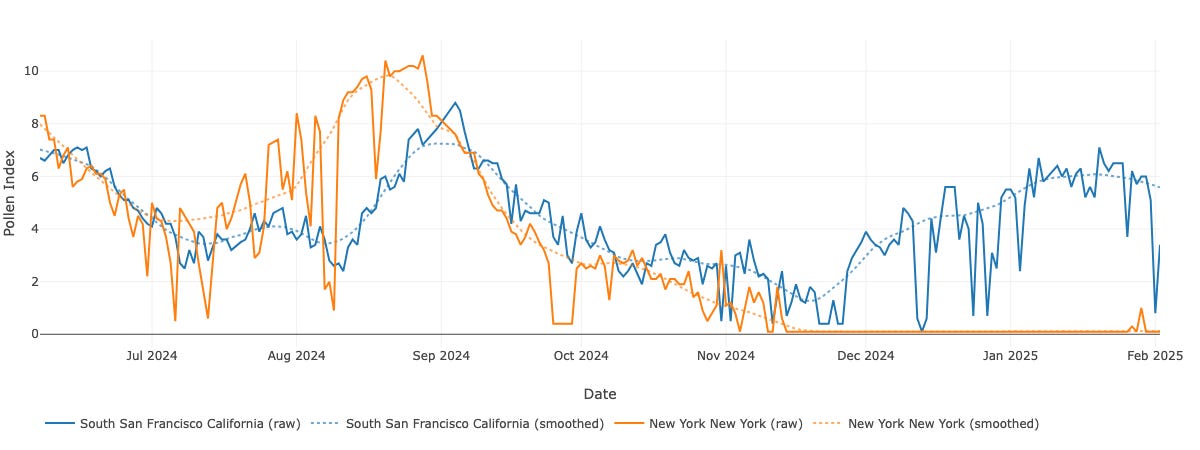
Interactive chart for comparing pollen levels across 245 locations in the continental US over time. Here's a snapshot:
Time series choropleth map from smoothed time series:
Smoothing is done with LOWESS independently for each location. Noise seems to account for only a small amount of variation in the data; the primary effect of smoothing is to remove fluctuations caused by rainfall.
Time series choropleth map from the raw time series:
Map of total pollen burden (the integral of pollen burden over timespan of data collection — expect this to change substantially with the 12 month update):


Pollen data sources
While researching potential data sources for this investigation, I found four sources (well, three plus n). I chose to use pollen.com’s data for the above graphics because of its spatial granularity and frequency of update. Contact me for up-to-date data.
It’s worth noting that regional pollen data doesn’t necessarily reflect the symptoms an allergic person will experience in that area. Symptoms depend on the specific plant species a person is allergic to and the concentration of pollen from those species in their immediate environment. Different species are major pollenators at different times of year. And, while pollen can travel miles in good (“good”) conditions, the major pollen sources are also determined by hyper-local factors like which tree species were fashionable in your parks department when they planted on your block.
Some data sources do list a few species that are most responsible for the pollen collected at pollen counting stations, but I’m not aware of any public datasets that fully disaggregate pollen counts by species.
National Allergy Bureau
The National Allergy Bureau (NAB), is a collection of pollen counting locations in the US, certified by the American Academy of Allergy, Asthma, and Immunology.
The NAB data benefits from transparent methodology, an exact addresses for each station, and a history of pollen data for each station. The records include pollen counts for the three major categories (tree, grass, and weed), as well as lists of the top species within each category, though they don’t give an indication of how much of the pollen comes from each species or how much of the pollen comes from species other than those.
The major downside of the NAB data is its sparsity. The 62 NAB-affiliated pollen counting stations are in 57 cities across 28 US states, Canada, Puerto Rico, Argentina, and Peru. 28 states is barely a majority and the Northern Great Plains are especially poorly represented, so it’s not exactly clear what you’re supposed to do if you live in the middle of North Dakota and want local pollen data (aside from kys). Further, the frequency and regularity of pollen counts varies by station, with many seemingly not having recorded data in the last 6 months.
Pollen.com
Pollen.com reports pollen levels from 245 locations in the continental US, updated daily. They don’t provide names or addresses for the pollen count locations, but they do provide the zip code of those counting stations at their map API.
Pollen levels are reported as a “pollen index”, with unclear relation to raw pollen counts. The three speices most responsible for the pollen are also listed, though they don’t give an indication of how much of the pollen comes from each species or how much of the pollen comes from species other than those.
I didn’t find a page describing their methodology for counting pollen. Pollen.com is owned by IQVIA, which manufactures the Rotorod sampler, so it seems likely that they count spores trapped by Rotorod samplers.
Logged-in users get access to annual overviews for each location. These basically show the same information as my interactive chart, but more coarsely and without the ability to make side-by-side comparisons
. They look like this:

Weather.com
Weather.com reports pollen levels for locations around the US, updated Monday through Friday. The 92 collection locations are listed on this page.
These data are broken down by category but not by species, and no historical pollen data is provided.
Ubiquitous 1-5 pollen scales
Finally, there are many sources that report pollen levels on a 1-5 scale at high spatial granularity (including around the globe). These include Google’s Pollen API, The Weather Underground, Accuweather, and tomorrow.io. I didn’t find information about data sources for any of them, and they often disagree with each other. None of them reports historical pollen levels.